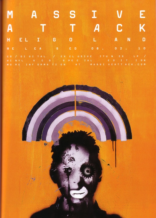
The album cover stands out - the image of the person deviates from the norm in that it's not an actual person, and that the picture appears to have been formed via a collage. This makes it quite eye catchy in the context of a magazine - which will normally be full of faces of young models.
The black-and white face (and rainbow) is also somewhat reflective of the kind of music that is on the album. Most of the songs have very simple melodies and rhythms - which an audience can simultaneously keep track of at once.
The way in which the text is laid out on the advert as well, is projecting an image that the music does not fit within the mainstream category. This means that the target audience they are looking for will be attracted to the advert, and may decide to look into the band.
No comments:
Post a Comment